WHAT WAS CLAIMED
A graph proves that the rise in atmospheric C02 is dominated by natural factors, not anthropogenic emissions.
OUR VERDICT
False. The graph misleadingly compares the rate at which CO2 is being added each year with the amount that is in the atmosphere.
Social media users are rehashing old claims that humans aren't responsible for increasing carbon dioxide levels because CO2 emissions don't correlate with concentrations in the atmosphere.
This is false. Experts told AAP FactCheck the claim is based on an analysis of a graph which includes significant mathematical errors.
The graph plots global CO2 emissions and atmospheric concentration levels, showing they don't correlate from the year 2000 to 2023 - the emissions rise and fall, sometimes dramatically, while concentration levels steadily increase.
But the graph is deceptive as the two lines represent different things mathematically - a rate versus an amount - which is why they don't correlate.
The claim's premise was debunked more than a decade ago, but appeared on an Australian climate sceptics Facebook page (archived here) in February 2024.
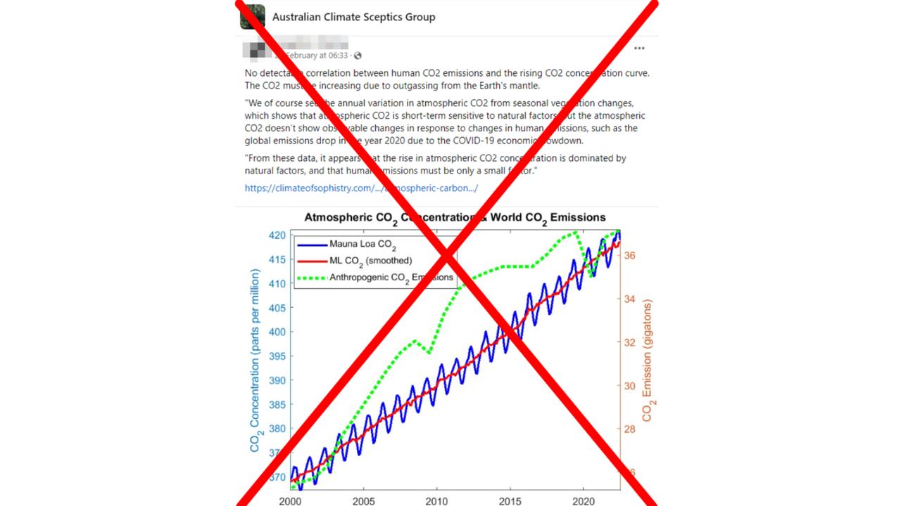
Text on post claims: "No detectable correlation between human CO2 emissions and the rising CO2 concentration curve. The CO2 must be increasing due to outgassing from the earth's mantle."
The post links to an article which claims the graph "shows that the rising atmospheric CO2 concentration appears to be relatively insensitive to annual changes in global industrial CO2 emissions".
The article claims this proves "atmospheric CO2 doesn't show observable changes in response to changes in human emissions, such as the global emissions drop in the year 2020 due to the COVID-19 economic slowdown".
The atmospheric CO2 concentration data is from the National Oceanic and Atmospheric Administration (NOAA) observatory at Mauna Loa in Hawaii. The CO2 emissions data is from the Global Carbon Project as seen here.
Climate scientists told AAP FactCheck the post's claims were false and that it was misleading to compare the two sets of data in the graph.
Steven Sherwood, from the Climate Change Research Centre at UNSW Sydney, said the claim was based on the mathematical error of confusing a rate with an amount.
Professor Sherwood said CO2 levels could be compared to the balance of a bank account - the CO2 concentration was the total amount saved, while yearly emissions were how much was continually deposited.
Different amounts may be deposited each year, but the total keeps increasing.
"If you earn $100K one year and only $90K the next year, you will hardly see that in your bank balance statements, if your expenses are only $30K," Prof Sherwood said in an email.
Prof Sherwood said earth's CO2 concentration level was increasing steadily because emissions were almost the same every year.
"The only way for CO2 to decrease (like seeing your bank balance drop) would be if we stopped net emissions of CO2 entirely, which did not come close to happening even during COVID," he said.
"The correct comparison is to compare cumulative emissions (total emitted since beginning of industrial revolution) against concentration."
Kim Reid, from Monash University's School of Earth Atmosphere and Environment, also pointed out the mathematical error of trying to compare total CO2 concentrations with emissions rates.
She said the graph's data actually highlighted the vast work needed to tackle rising CO2 levels.
"Even though most of our lives stopped during the pandemic, emissions didn't actually drop that much. In 2020, CO2 emissions were about the same as they were in 2012 with no pandemic," Ms Reid said.
"It wasn't really a significant enough decrease to make a dent in atmospheric CO2. Which means humanity needs to do a lot more than cut back on a few overseas trips to keep below 2C (rise in temperature)."
Zebedee Nicholls, from the University of Melbourne, told AAP FactCheck the claim's basic assumption - that CO2 emissions and concentrations should move in unison - was wrong.
To explain the mathematical error in layman's terms, he compared it to garbage trucks going to the tip.
"If more garbage trucks go to the tip, the amount of rubbish in the tip increases more quickly. If fewer garbage trucks go to the tip, the amount of rubbish in the tip still increases, it just increases at a slower rate," Mr Nicholls said.
"There is clearly a relationship between the amount of rubbish in a tip and the number of garbage trucks which go there each day."
However, he said the claim was assuming a direct 1:1 relationship between CO2 concentration and yearly emissions - or the tip and garbage trucks.
"If I use the claim's logic, the only possible relationship between the number of garbage trucks which visit the tip and the amount of rubbish in the tip is this: if fewer garbage trucks go to the tip, the amount of rubbish goes down; if more garbage trucks go to the tip, the amount of rubbish goes up. By the claim's logic, no other possible relationships exist," Mr Nicholls said
The Verdict
The claim that a graph proves the rise in atmospheric C02 is dominated by natural factors, not anthropogenic emissions is false.
Experts told AAP FactCheck the graph claiming to show a lack of correlation between CO2 emissions and concentration levels is mathematically flawed, misleadingly comparing a rate with an amount.
Emissions relate to how much we are adding to the atmosphere each year, while concentration relates to how much there is in total.
False — The claim is inaccurate.
AAP FactCheck is an accredited member of the International Fact-Checking Network. To keep up with our latest fact checks, follow us on Facebook, Twitter and Instagram.